- Graphisoft Community (INT)
- :
- Forum
- :
- Visualization
- :
- W.I.P. - Interior Rendering - please critique tech...
- Subscribe to RSS Feed
- Mark Topic as New
- Mark Topic as Read
- Pin this post for me
- Bookmark
- Subscribe to Topic
- Mute
- Printer Friendly Page
W.I.P. - Interior Rendering - please critique technique
- Mark as New
- Bookmark
- Subscribe
- Mute
- Subscribe to RSS Feed
- Permalink
- Report Inappropriate Content
2010-11-13
06:58 PM
- last edited on
2023-05-11
12:10 PM
by
Noemi Balogh
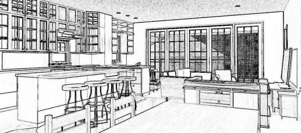
we are remodeling a current home owners home and had created this interior rendering.
Completely done on Archicad with a minor 'photochop' technique I use.
But for the most part...done in Archicad.
Suggestions on how to improve "technique" are welcome please.

i>u
Edgewater, FL!
SOFTWARE VERSION:
Archicad 22, Archicad 23
Windows7 -OS, MAC Maverick OS
- Mark as New
- Bookmark
- Subscribe
- Mute
- Subscribe to RSS Feed
- Permalink
- Report Inappropriate Content
2010-11-13 07:02 PM
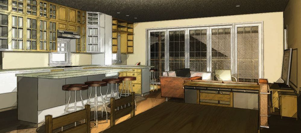
On this forum...in this section I've seen some nice "water color" and "erased out" edges technique as well.
Would like some 'pointers' if you will on best way to do it either in Archicad or post-production (ala photochop).
thanks.
i>u
Edgewater, FL!
SOFTWARE VERSION:
Archicad 22, Archicad 23
Windows7 -OS, MAC Maverick OS
- Mark as New
- Bookmark
- Subscribe
- Mute
- Subscribe to RSS Feed
- Permalink
- Report Inappropriate Content
2010-11-13 08:47 PM
• If this is to look more like a sketch, reduce the lighting effect because it distracts.
Interior renderings need to be properly populated with entourage so laypeople find them comfortable. It is worth the time because accessories provide plausibility, even if only to the level of a department store display:
— your glass front cabinets need stuff inside
— your foreground table is dark and needs a table setting with light
— counters need stuff.
— lamp in sofa area.
— artwork.
— The composition has no focus to lead the eye into the scene. We need to leap over the table to enter the room. Find a better viewpoint.
— Too much ceiling and peripheral nonsense. [see cropped attachment for a suggestion]. Keep it tight like a magazine photo.
— Just what jarring mess is that through the french doors? Make the exterior happier.
— get some sunlight to course into the room for contrast.
• If this is to look more like a photo rendering:
— There's no such thing as white!!! Placing an uncolored general light in the center of the scene makes ugly glaring light. Make plausible, warm light. I added some yellow warmth to my example.
— the downlights create over-exposure. Turn them down.
— set up softer shadows.
— do you have camera light on? Turn it off.
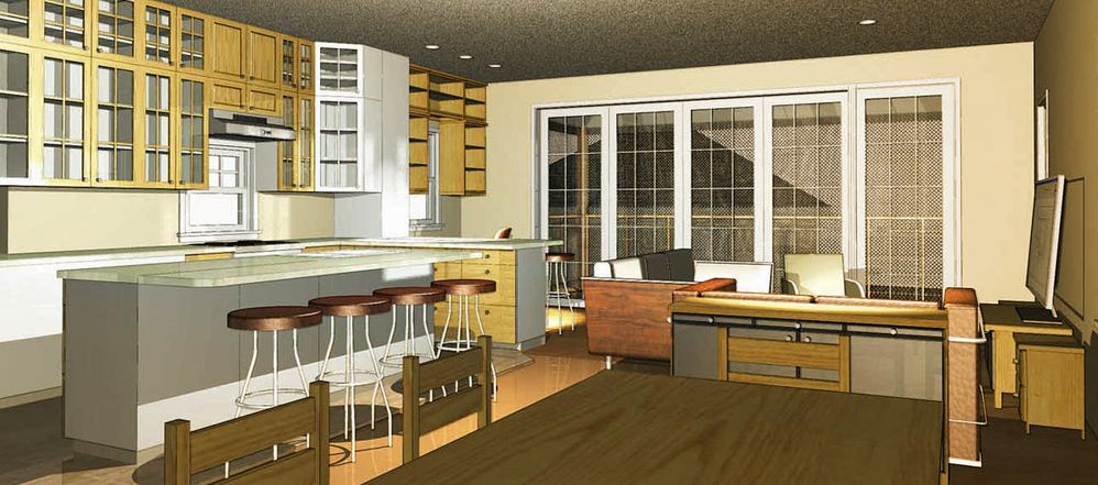
- Mark as New
- Bookmark
- Subscribe
- Mute
- Subscribe to RSS Feed
- Permalink
- Report Inappropriate Content
2010-11-13 09:08 PM
Yes...meant to look more like a "sketchy" concept idea vs. a photo-real rendering.
thanks for you comments. They help.
i>u
Edgewater, FL!
SOFTWARE VERSION:
Archicad 22, Archicad 23
Windows7 -OS, MAC Maverick OS
- Mark as New
- Bookmark
- Subscribe
- Mute
- Subscribe to RSS Feed
- Permalink
- Report Inappropriate Content
2010-11-13 10:41 PM
rob2218 wrote:For a really sketchy look you can shoot the same view with both the sketch and photo renderers and overlay the former onto the latter in Photoshop. For this to work you have to knock out the white space from the sketch layer (magic wand in Photoshop) and (usually) tone down the colors in the photo rendering. I usually do the latter with and adjustment layer (transparency/brightness/contrast) in between the sketch and color layers.
thanks Dwight!
Yes...meant to look more like a "sketchy" concept idea vs. a photo-real rendering.
thanks for you comments. They help.
For best results I render the sketch image at twice the resolution (four times the size) to get sharper lines while saving time by not overdoing the color part. When I have a bunch of them to do I set up publisher sets in ArchiCAD and an automated process in Photoshop so it's all pretty automatic.
- Mark as New
- Bookmark
- Subscribe
- Mute
- Subscribe to RSS Feed
- Permalink
- Report Inappropriate Content
2010-11-14 01:49 AM
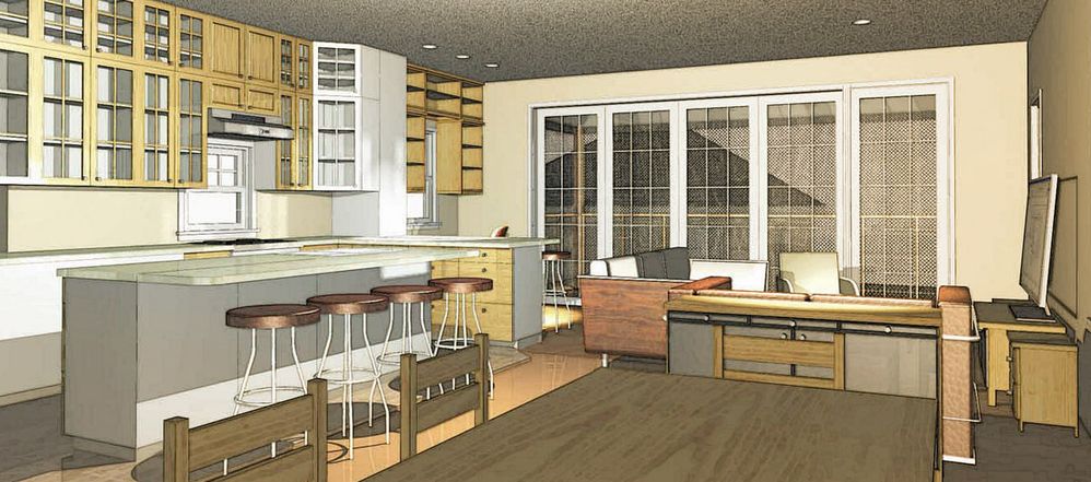
If you are taking your image into Photoshop at all, just use one of the edge enhancement filters available there.
For instance, here's accented edges at 50%.
You can instantly apply these effects.
- Mark as New
- Bookmark
- Subscribe
- Mute
- Subscribe to RSS Feed
- Permalink
- Report Inappropriate Content
2010-11-14 01:54 AM
- Mark as New
- Bookmark
- Subscribe
- Mute
- Subscribe to RSS Feed
- Permalink
- Report Inappropriate Content
2010-11-14 01:59 AM
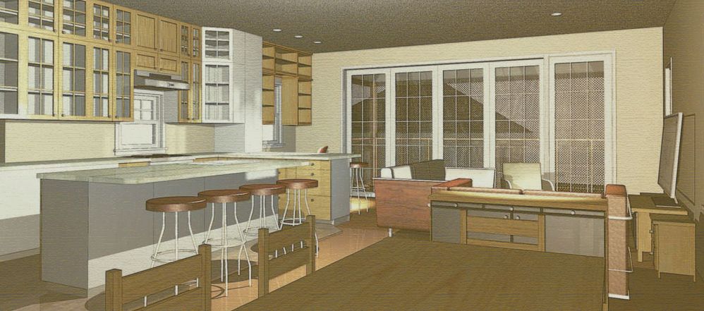
Here's conte crayon [with image complimenting colors] @50%
- Mark as New
- Bookmark
- Subscribe
- Mute
- Subscribe to RSS Feed
- Permalink
- Report Inappropriate Content
2010-11-14 02:06 AM
- Mark as New
- Bookmark
- Subscribe
- Mute
- Subscribe to RSS Feed
- Permalink
- Report Inappropriate Content
2010-11-15 05:55 PM
The "white and black" outline one looks like kaka.
Don't like that technique at all.
How did you do the darker toned one?
something about bringing it in photochop and doing what to the edge settings?
With regards to how I get the initial rendering...did just what one user said, did a "sketch" rendering, then did a "lightworks" rendering (both with same DPI and view settings). The opened the "material" (lightworks) rendering in photochop, opened the "sketch" rendering in in photochop, selected all in the sketch one, copy/pasted it into the "materials" one.
Adjusted the opacity setting of the sketch to be more "transparent".
then did the "HUE/Saturation" level bumped it up in photochop.
then used the "filter - sharpen" the sketch one to get me more of a crisper lines....and combined the two into on JPG.
i>u
Edgewater, FL!
SOFTWARE VERSION:
Archicad 22, Archicad 23
Windows7 -OS, MAC Maverick OS

